Apr
24

After a 2 year break, Panthagraphics is proud to come back together. With many new ideas floating around and more of our comic to be completed soon we can’t wait to show off some of our new work!

John’s 2 sents: Its great 2 be back in commision with Matt, there’s a lot to the comic that I want to get done and I’m sure there’s a lot Matt wants to get done. Since we’re both busy, however, it may take longer than usual for us to produce our work but it will be produced nontheless. I hope that you continue to enjoy our work as we progress and make a come back as Panthagraphics! Do work! (That’s our saying ;))

Matt: New work to be released this week. Its my first day back to tracing. One project has already been done and working on another right now. Leave us some idea! What do you like about Panthagraphics? Whats your favorite poster we have done so far?

Jun
14

As we said we would, we have given you the colored version of Rose. As far as I know there is not an extensive background to this character she is more for concept purposes.

John’s 2 cents: I drew this particular picture about a year ago. In the original pencil drawing I was going for more of a “real” look instead of a comical animated look. There’s not much to this picture  but it was good practice for Matt. There is one thing though, the feet are a little unbelievable, I will definitely try to fix that up when I can but over all this was just a random picture I decided to draw just messing around one day. (Please feel free to criticize…criticizing is good, but if you criticize me you’d better criticize Matt to 😉 )

Jun
11

We here at PanthaGraphics (yes located conveniently in El Cajon California) have recently completed this fine drawing you see to your left. However, we also have decided not to post the colored copy until monday. We think it has turned into a great project that was actually a speedy project as well.

Check back on monday to see her colored 🙂

Jun
04

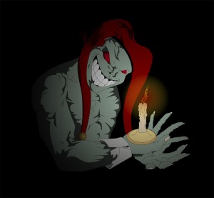
Well, we decided instead of posting more ideas or concept art that we would actually give a taste of our upcoming comic. These two panels come off the second page, were the storyline starts to show up. I’m gonna leave John to explain the creature and the plot though in his two cents section!

Both panels for me were very time-consuming, but very fun at the same time. I think that Johns idea behind the creatures came across very well. You can tell that both characters hold a lot of emotion, in this case fear. Since I am the inker it would make sense for me to also comment on the colors. When I think of something more evil than good I think of a warm color, it sends a subliminal message of evil to me. It was an easy decision to try to add some red on the creature. However, the blue shirt does not fit what I just said. This was because of the character background of the creatures. They used to be humans, now transformed to these beings of evil. The girl follows the warm / cold idea of colors. She is not a main character and we wanted for her to seem defenseless in comparison to the creature. Let me know what you think of this panel!

Johns Two Cents: Now although Matt has had some very “deep” 🙂 lines, now its my turn. As Matt said the plot begins to slowly reveal itself in this page. I’ll start with the creature. These creatures are called “Creatures of Yin,” and  if you don’t know what yin is it is the black half of the Yin Yang symbol which represents the cold and dark elements of the universe that help to balance it. So this would be, in this comic, a human who couldn’t handle the imbalance of the overwhelming negative energy and was transformed into what the universe declared as unbalanced, which would be the yin of the universe. There are many of these “Creatures of Yin” that will appear in the comic, some of which are more significantly  intelligent than these passive creatures. (This would apply to some of the actual “bad guys” who are more relevant to the story character wise, not all of them.) As you’ve probably already guessed this comic revolves around the Chinese beliefs behind Yin and Yang as far as the universe being balanced, and hopefully I’ve translated the idea that the problem(s) in the story are mainly a result of an imbalance of more Yin than Yang. I also hope for this comic to be some sort of reflection of real life appliance in being balanced in all aspects of life. (Hopefully if there is some imbalance we don’t get crazy monsters that try to kill us) 🙂

Note: 1. New pages to be scanned soon 2. A recreation of a video game character will also be inked soon, as John has already drawn it out. Check back for updates!

May
28

This character is probably among one of the toughest characters in the comic. She is a good guy (girl) and the beloved sister of Hack. (hence the style of clothing) Her name is Jack, which is short for Jacqueline, and her style of clothing and name were meant to mimic Hack’s because they are twin sisters. Jack, however, is a lot more up front than Hack is. Although Jack is a genius much like her sister, she prefers to handle things hand to hand in a Karate fighting style. I drew this picture sometime early last year and wanted to go for a rough look which is why in the original I used the type of shading I did. As far as Matt’s coloring job, we used the color scheme we did because the green on her is kind of a military green and it hopefully added to the “roughness” factor of the art piece.

I am sorry for the slow progress of work, it’s just I started working and my time to draw has been cut short. Make no mistake though, the comic is progressing well with the third page basically complete and ready for coloring, and the fourth page in the works. On an unrelated note, I have spawned an idea that Matt and I have agreed shows some serious possibilities.

Matts 2 cents: I have no idea what Johns talking about 😉

However, as far as this drawing goes we are happy how it progressed. As John said we wanted this character to look rough, so we thought the military style colors worked well.

Note: I am very interested in knowing what everyone thinks about the shadows behind Jack (her shadow). I usually don’t trace shadows this way, but thought I would experiment. Please leave a comment with feedback if you have a chance. Thanks!

May
17

Matt has FINALLY finished one of my older drawings that I didn’t really want to post, but he insisted on it. So since its up I’ll give some background. This character lives by the code of the Japanese Samurai. (I still need to do some research on that front so it can be authentic) This characters name is Mynx, and the idea of the name comes from the manx cat. Mynx  however is blind which is why her mask has no eye holes, and another thing is that her sword only has one sharp side the other side is flat, as you can see in the picture.(For those who want to get technical, yes a samurai sword is very thin so technically there s no flat side, so the other side of the sword is blunt so to speak) She also has an interesting ninja star in her hand which is ironic because ninja are dishonorable samurai and for an honorable one to hold a weapon of a dishonorable one is strange which makes Mynx quite a different samurai.

Matt’s 2 Sents.- I found Johns post interesting, on a more serious note though this post took some time to complete but really only due to the fact we didn’t know what color scheme we wanted for her. Today we have an extended three-hour period in class so I picked it up to finish.

May
07

Matt has finally finished the coloring of the fairy girl. (It’s not really a fairy girl but still no name at this point) On this one we were going for a softer look because when I came up with this character I wanted her to appear innocent and somewhat defenseless. This is highly to the contrary for the make-up of this characters actual character. The idea that I spawned for her is that she would appear to be innocent and defenseless, as I said, but in reality she is going to be a character who basically “kicks butt,” as the saying goes. 🙂 She also has a unique weapon that she uses which isn’t in this picture, but at some point I do plan on drawing another of her with her weapon and a different outfit as well.

Matts Two Sents: This project was a really fun one for me to trace. It only took me about 3 days to complete even though it has taken some time to post it. I think the colors work well with the skin tone and the way we wanted to present this character. Some soft gradients of white and light blue were added to take the “hard” look away from it. Enjoy!

Apr
30

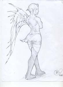
This is a picture that I just finished and I think it came out well. 🙂 This is just a preview of the image before color, and Matt plans on coloring it after completing the coloring of the second page of the comic, which is pretty much done. Anyways, this is a new character for the comic who may not appear in this first comic, but I had the idea and had to get it on paper. I don’t have a story or even a name and really don’t even know what she is (it looks cool though) but she isn’t really a fairy it’s just what we named it because we couldn’t think of anything else, and plus when I first started to draw the picture she looked like a fairy which is where the idea for a wing came in.

Matt’s two sents: Lets see how long this takes me to color 😉

Apr
19

This is my (John) character in the years into the future. I drew this picture some time in the middle of last year and had the idea of “Afro Samurai” type kind of art in mind,which will explain the way the hair was drawn.

My original intention was not to give my character a sword because in the comic I use a staff, but when I started drawing the picture I had the position in mind and, in this particular case, I thought a sword would look better. Considering that and the way the hair is, it gets a lot of references to the animated series “Afro Samurai,” this is no way the character of Afro Samurai however.

Matt’s Two Sentences: This was a fun picture to “ink”. Wow only one sentence of insight. Oh well, more projects to be posted soon 🙂

Apr
12

Well we haven’t had a post in almost a month now. Spring break rolled around and John and I definitely enjoyed the break from school.

However, we here at PanthaGraphics never stopped working on projects over the last month. A lot of ideas have been tossed around, I’ve started and finished up a lot projects as far as coloring them. John has completed drawing the 2nd and 3rd pages to the comic which I will be able to scan and start working on soon too!

The project shown in this post was something I decided to start this last Friday. In total it took me roughly four hours to trace everything and then color it.

(John’s 2 sentences) Keep in mind though that this is still highly a work in progress, I haven’t even finished drawing it yet. Feel free to let us know what you think! As Matt said the second page is completed along with the nearly completed third.

Note: More info on the naming conventions and character info to come after this project is complete.